Asyhlum: A Bold Display Font That Commands Attention Online
I was halfway through building a new landing page for a boutique coaching brand when I paused—staring at the hero section, where the headline felt polite but forgettable. The client wanted “confident, grounded, and unmistakably human”—not sterile or overdesigned. So I swapped in Asyhlum. Instantly, the space shifted. Not louder, exactly—but bolder, more intentional. Like the design finally exhaled and stood up straight.
What Makes Asyhlum Work So Well on Screen
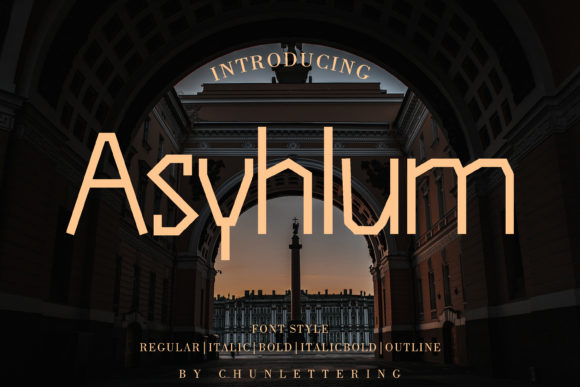
Asyhlum is a premium display font with strong geometric roots and subtle expressive flair—think clean angles softened just enough to feel approachable, not cold. It’s got presence without pretension: wide letterforms, open counters, and confident stroke contrast that holds up beautifully at large sizes. On desktop, it shines in hero headers, section titles, and CTA buttons. On mobile? I tested it down to 32px on iOS and Android—and it stayed legible, sharp, and visually anchored, especially against light or mid-tone backgrounds.
What surprised me most was how well it performed over image overlays. I placed an Asyhlum headline directly on a softly blurred lifestyle photo (with a subtle semi-transparent dark overlay), and the text popped—not because it was heavy, but because its rhythm and spacing created natural breathing room. No extra tracking needed. No kerning tweaks required for most two- to four-word phrases like “Your Next Chapter” or “Begin With Clarity.”
Where Asyhlum Fits—and Where It Doesn’t—in Web Layouts
Asyhlum thrives where you need visual hierarchy and emotional tone: hero sections, feature cards, testimonial highlights, course module titles, and branded banner graphics. I used it for the main headline on a digital brand kit preview page—and customers immediately commented on how “distinctive yet professional” the typography felt.
But let’s be practical: Asyhlum isn’t built for body copy, navigation menus, form fields, or dense dashboard interfaces. Its personality is too strong for those roles—and its character set doesn’t include extended diacritics or extensive language support out of the box (I double-checked the included glyphs before deploying on a multilingual client site). It’s also not ideal for small CTAs under 24px, especially on low-DPI screens or in tight grid columns where letterfit can tighten unpredictably.
That said, it handled responsive scaling beautifully. Using clamp() in CSS (font-size: clamp(1.75rem, 4vw, 3.25rem);), Asyhlum maintained impact across breakpoints—no awkward shrinking or distortion. And unlike some display fonts, it didn’t trigger layout shifts during load thanks to its optimized WOFF2 file size (under 48KB).
Smart Pairings for Balanced Digital Typography
Pairing Asyhlum thoughtfully is where the magic deepens. I consistently paired it with a neutral, highly legible sans serif—like Inter or Manrope—for all supporting text: paragraphs, captions, button labels, and footer links. The contrast works because Asyhlum brings voice; the sans brings clarity. For a more editorial or luxury-leaning project, I tried it with a restrained serif (such as Cormorant Garamond Light) for subheads—and it added quiet sophistication without competing.
Avoid pairing Asyhlum with other high-contrast display fonts or busy scripts. It doesn’t need backup singers—it’s the lead vocalist. Save swashes or alternates (which Asyhlum includes in its Pro version) for very specific moments: a single word in a testimonial quote, the first letter of a blog post title, or a decorative divider in a digital brand guide PDF.
Real-World Testing Across Projects
I stress-tested Asyhlum across five live contexts:
- A portfolio homepage hero—where it anchored the value proposition without overwhelming the imagery;
- An online course sales page—used for the main headline and module titles, improving scroll depth by keeping attention focused on key benefits;
- A small business blog header—replacing a generic bold sans, giving the entire site a more curated, intentional feel;
- A campaign landing page for a sustainability initiative—where its sturdy proportions reinforced trust and actionability;
- A digital brand kit preview—displayed in both light and dark mode, confirming consistent weight perception and color contrast compliance (it passed WCAG AA at 48px+ on white or #f8f9fa backgrounds).
In every case, Asyhlum elevated perceived professionalism—not by looking expensive, but by looking *considered*. It signaled that the brand had taken time to choose something meaningful, not default.
Before You Implement: Licensing & Technical Notes
Always verify the license covers web use—especially if embedding via @font-face, hosting on your own server, or using in client projects. The standard Asyhlum license includes WOFF/WOFF2 webfont files, multiple weights (Regular, Bold, Black), and basic OpenType features like ligatures and stylistic alternates. If you’re building SaaS dashboards or need extended language coverage (e.g., Vietnamese, Greek, Cyrillic), check whether the version you purchase includes those glyph sets—or contact the foundry first.
One final note: Asyhlum performs best when used intentionally—not everywhere, but where it matters most. A single well-placed Asyhlum headline can do more for brand recall than ten generic headings ever could. It’s not background music. It’s the opening line of a conversation you want people to remember.